 Skip to main content
AUTUMN / WINTER 2017 INTERIOR DESIGN TRENDS

What's going to be the next seasons' trend?
Which colours to use/wear?
How can we predict trends?
Let's start with colours, every season the 'Pantone Colour Institute' evaluates the colours used on the runways and design shows. This is then used to create a colour report and top 10 colours are chosen for the upcoming season, they're usually the ones seen the most on the runways and all different kinds of shows. They're divided into 'colours for men' & 'colours for women', the colours also differ from different parts of the world. For the first time ever, London Fashion week was added to their seasonal report.
I'm going to show you examples of colours chosen for Autumn/Winter 2017 in London and in New York. It doesn't mean that every city or country has completely different colours, those colours are going to be all around the world next season, they just vary a little in shades or some of the colours were used more on the runways in a specific city!
“There is a commonality between the colours we are seeing on the runway in New York and London.” - Leatrice Eiseman, Executive Director of the Pantone Colour Institute.
“However, individuality is evident and we are seeing a distinct difference between the shows in the two cities in the way these same colours are being combined.”
New York

London

You can find more information about those colours on Pantone's official website!
At the start of 2017 we already started to see more of rich tones, personally I've been seeing a lot of deep greens & blues paired with very soft pastel colours, I especially love the combination of deep teal tones against a light dusty pink background. Next season is going to be a mixture of Romance & Bohemian - ruby reds, vibrant purples, blues and greens with soft pastels.
People are becoming more colour conscious, I can already see more vibrant and upbeat interiors than last year. Now is the time to add some rich tones to your Scandinavian interiors!
Let's start with a few examples of teal tones used in Interiors;


Get the look
(click on the images to see more details)
Dark feature wall;
Dark feature wall;


Plants;


Sofas;


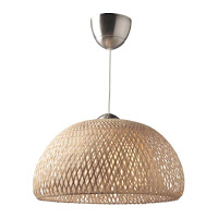
Earthy colours will also become very popular in Autumn 2017; terracotta, sand, ochre, cinnamon, rust, olive green. These colours are great for minimalist design lovers, Scandinavian design may include more warm tones in 2017. They're very versatile, you can create a calm muted interior with all neutrals and add a pop of colour as an accent.

Get the look
(click on the images to see more details)
Pastel Furniture;
Pastel Furniture;


Bamboo Pendant Lighting;


Previous years were all about hi-gloss, metallic, super shiny finishes. 2017 will bring us some contrast and we'll have a bit more use of raw materials like; exposed brick walls, cement floors and blown plaster finishes, we're gonna be 'stripping' down our modern interiors into 'deconstructed luxe' spaces. It's all about that natural earthy look this year, plants and succulents will be a must next season! I can already see a lot of botanic designs all over media platforms, greenery inspires the whole colour palette this year, of course 'Pantone Colours' chose a fresh, grass green as a colour of the year!
Marble is still a trend this year, and will carry on throughout 2017, in autumn/winter it will be mixed mainly with wood and counterbalanced with plexiglass. The 90's will be back, with black velvet, geometric shapes and tartans.
I'm leaving you with a lot of inspiration, here are some interiors for Autumn/Winter 2017;


Sources:
All of the images are from Pinterest
All of the mood boards are created by me (marked with logo)


Shaded spruce is my go to color these days, along with copper! I am getting ready to re do my bathroom in those colors!
ReplyDeleteI love Blue and Green combination. I have to get this pin it to get some inspiration :)
ReplyDeleteGreen is one of my favorite colors to have in my house, so I'm loving these new trends!
ReplyDeleteI am loving teals, blues, and greens...They are my favorites!
ReplyDeleteI love these colors! Everything looks so relaxing but sophisticated at the same time. :)
ReplyDeleteI love pinks especially the primrose pink. It looks cool and classic put a dash of blue.
ReplyDeleteOh i Love these Colors... i makes me feel happy... especially the green , bring nature in our home....
ReplyDeleteVind de olijfgroen erg mooi als kleur op de muur. Wij hebben nu lever en gebroken wit, beetje saai... kamerplanten vind ik ook altijd mooi. Heb een yucca gehad, maar die is dood gegaan. Nu even geen grote kamerplant
ReplyDeleteGreen is my favorite color and after that it's all natural colors. I think it connect the garden and the livingroom. Also green is a color that eases the mindset.
ReplyDeleteMooie foto's! Ik vind vooral de combi's blauw/groen en groen/oranje erg mooi. Toch houd ik het bij mijn eigen favoriete kleurenschema. Ik ben niet zo trendgevoelig als het om inrichting gaat. Ik houd van modern met een 70's twist. Lekker vrolijk en gezellig. :)
ReplyDeleteThe muted colours are really my thing! Love them!
ReplyDeleteI love the green/pink/gold combo. Sadly, the boyfriend isn't to fond of gold. Or pink.
ReplyDeleteReally beautiful and inspiring post - love those blues... makes my home look really dull! Thanks for sharing!
ReplyDeleteSuper gave trends! Ik hou echt van de stoere industriële stijl, cleane muren en veel planten. Planten in huis maken me happy! Thnks voor de heerlijke inspiratie.
ReplyDelete